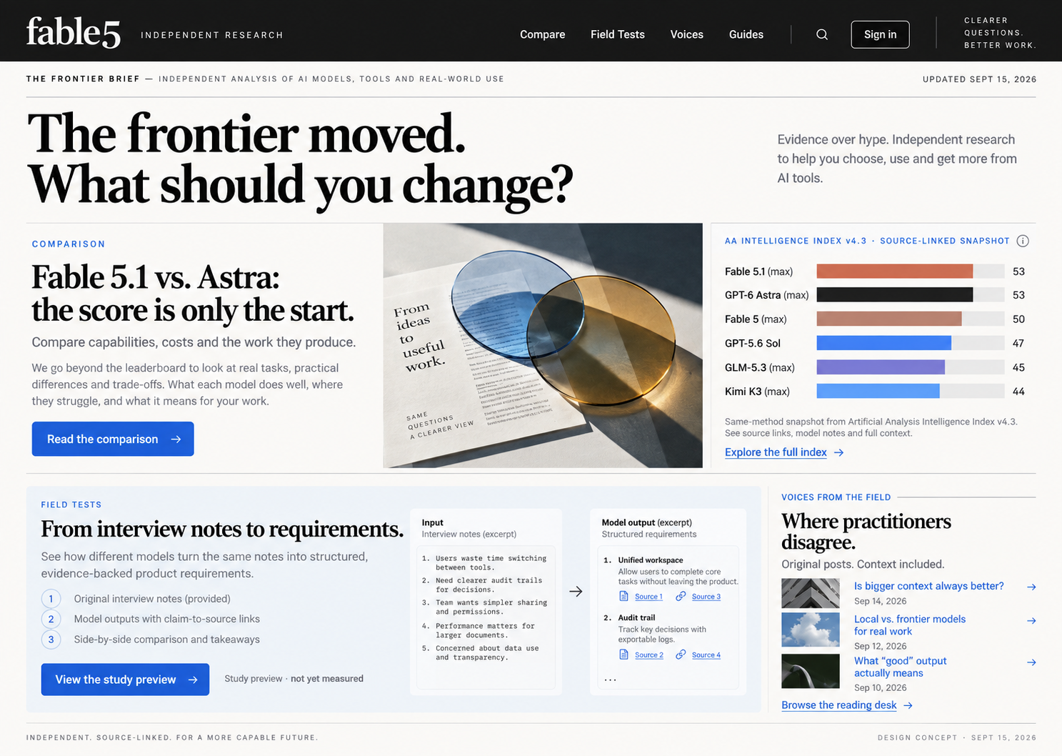
This is a design concept from our own site exploration—not the thing we sell.
What changed
The chosen direction uses an editorial masthead, a strong serif headline, clear white space and a blue evidence column. It makes research and practitioner voices visible together. The artwork shown above is the generated reference, not a screenshot of a finished production site.
What the image cannot prove
It does not establish mobile behaviour, accessible navigation, a working account or a valuable paid product. Numbers inside the concept image are layout examples, not research evidence. Those checks belong to the implementation and source review.
The reusable lesson
A specific visual reference can make a design discussion more concrete. Keep the selected reference and then verify the real website against it—including narrow screens and the clicks that lead to actual content. Do not confuse a convincing picture with a usable product.
See the implemented editorial direction →