Developer Tool Sitev0.1.1
Use this Skill to build a product website.
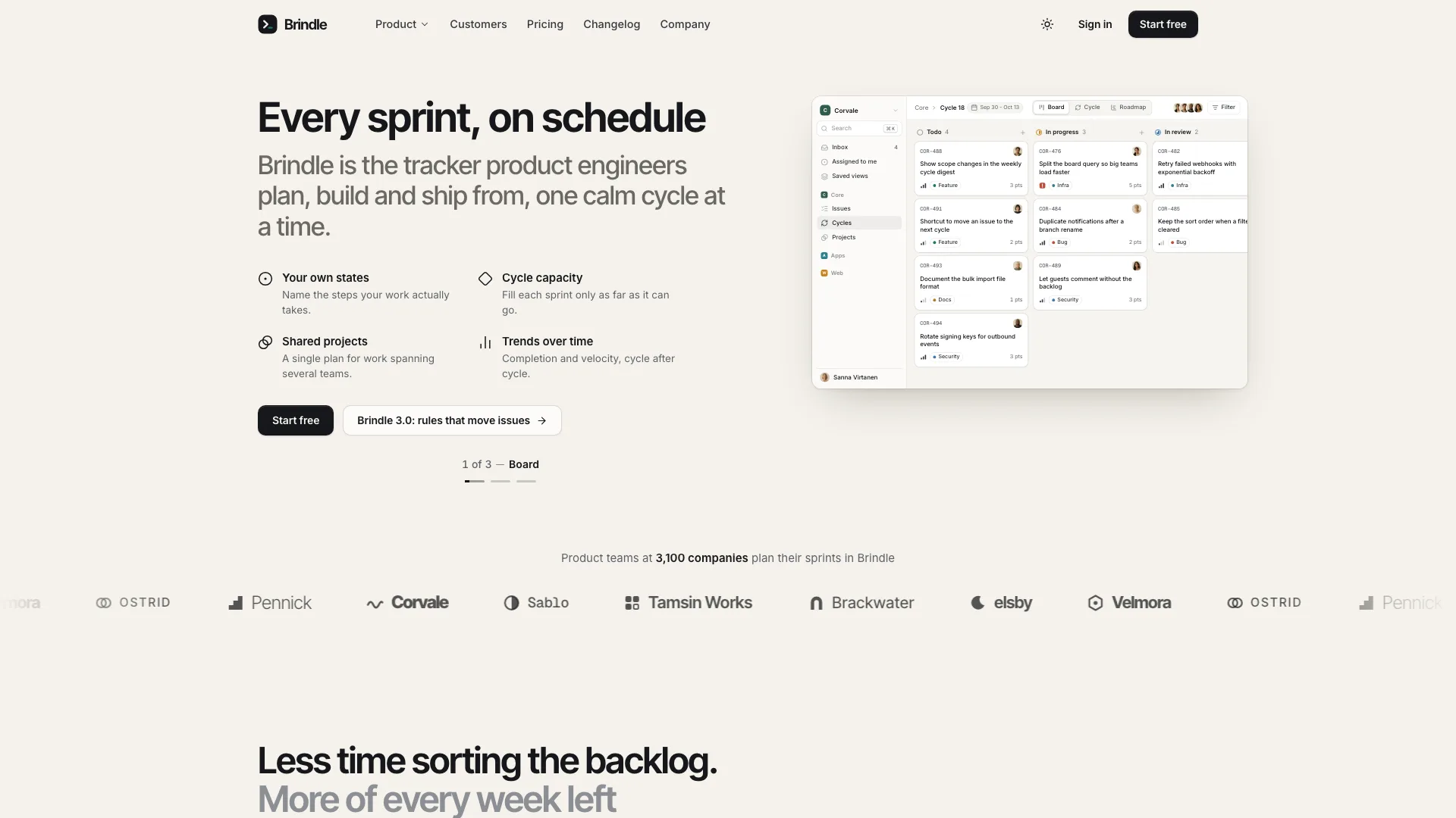
A website skill for Claude Fable 5 that ships a developer tool's whole marketing site as one offline HTML file: 12 views, a live product window, working forms, dark theme.
Picked most often by
Updated Oct 25, 2026
Preview gallery


Similar Skills
View all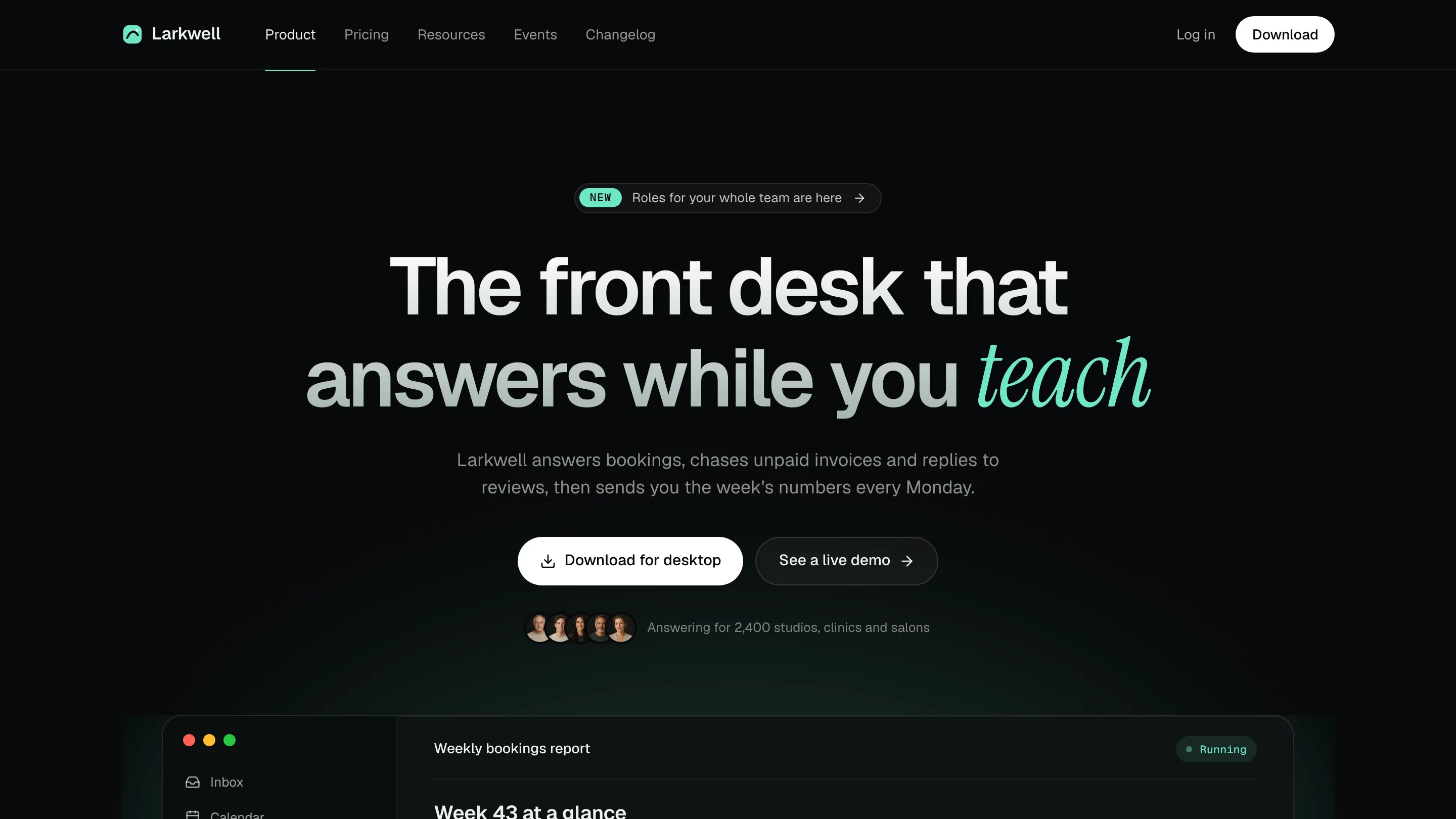
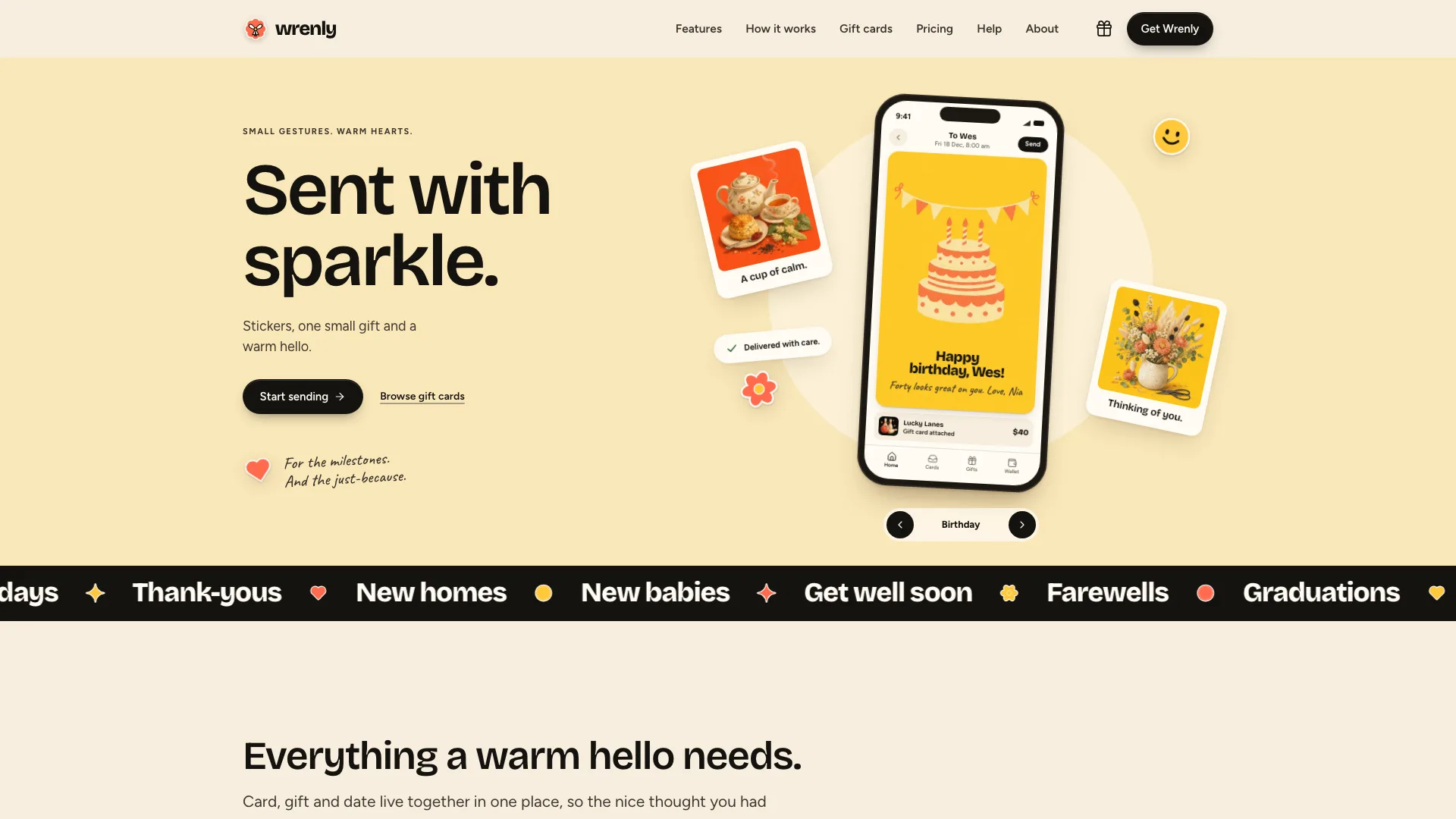
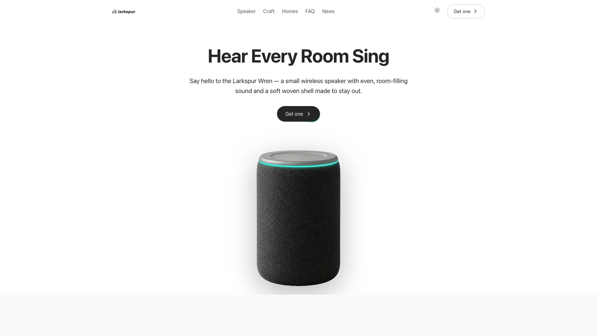
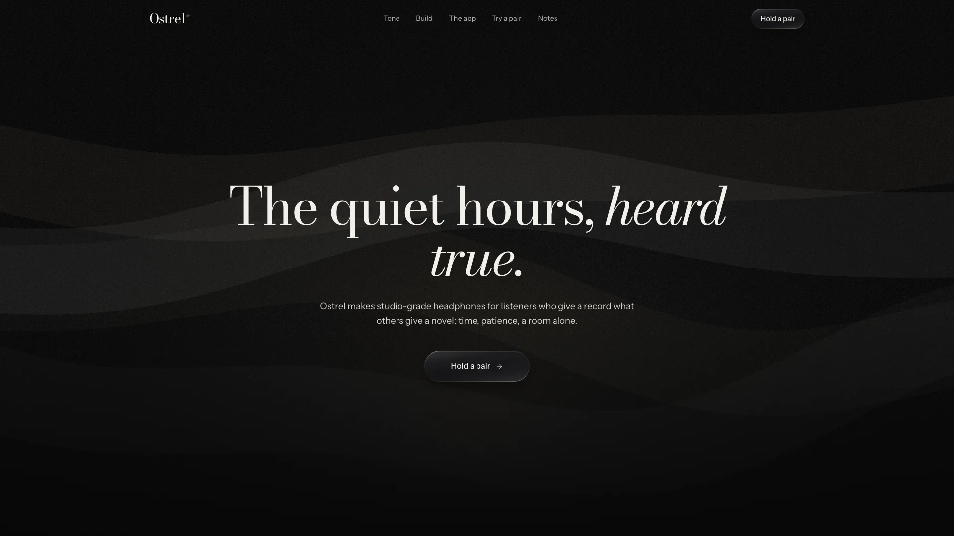
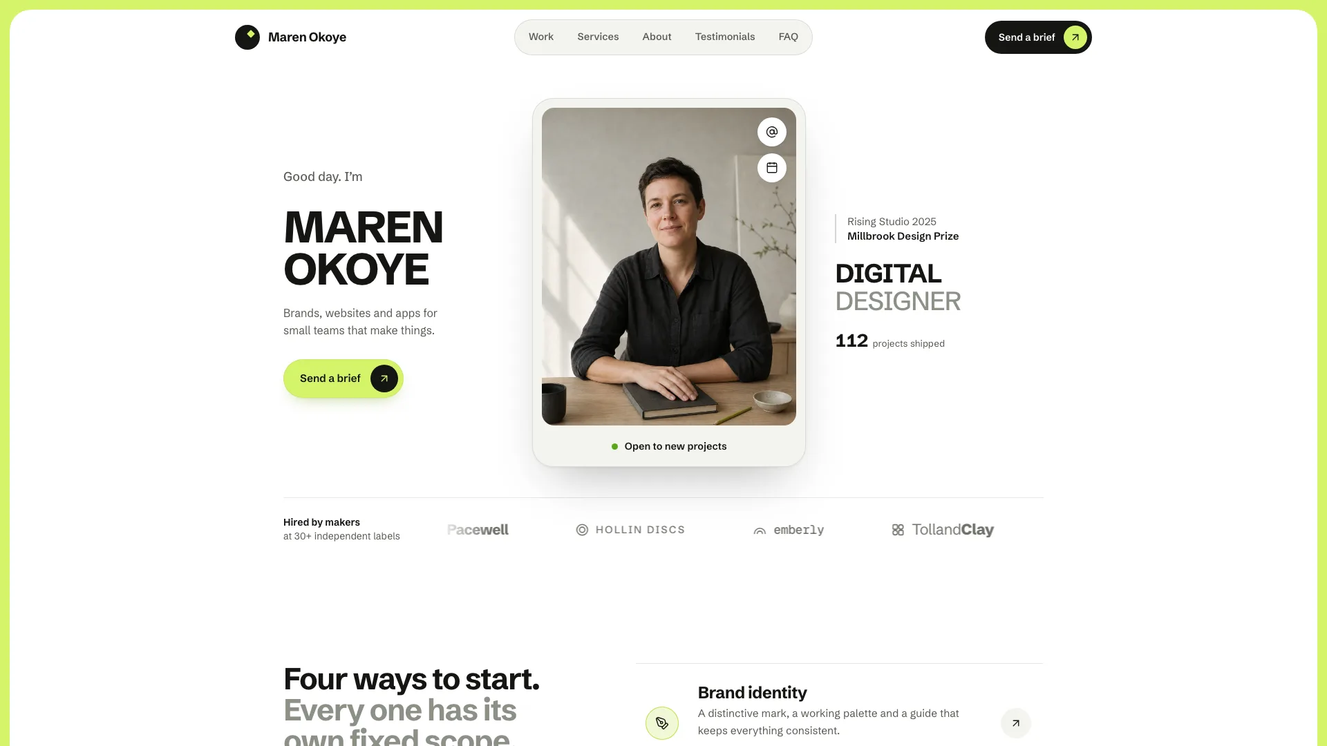
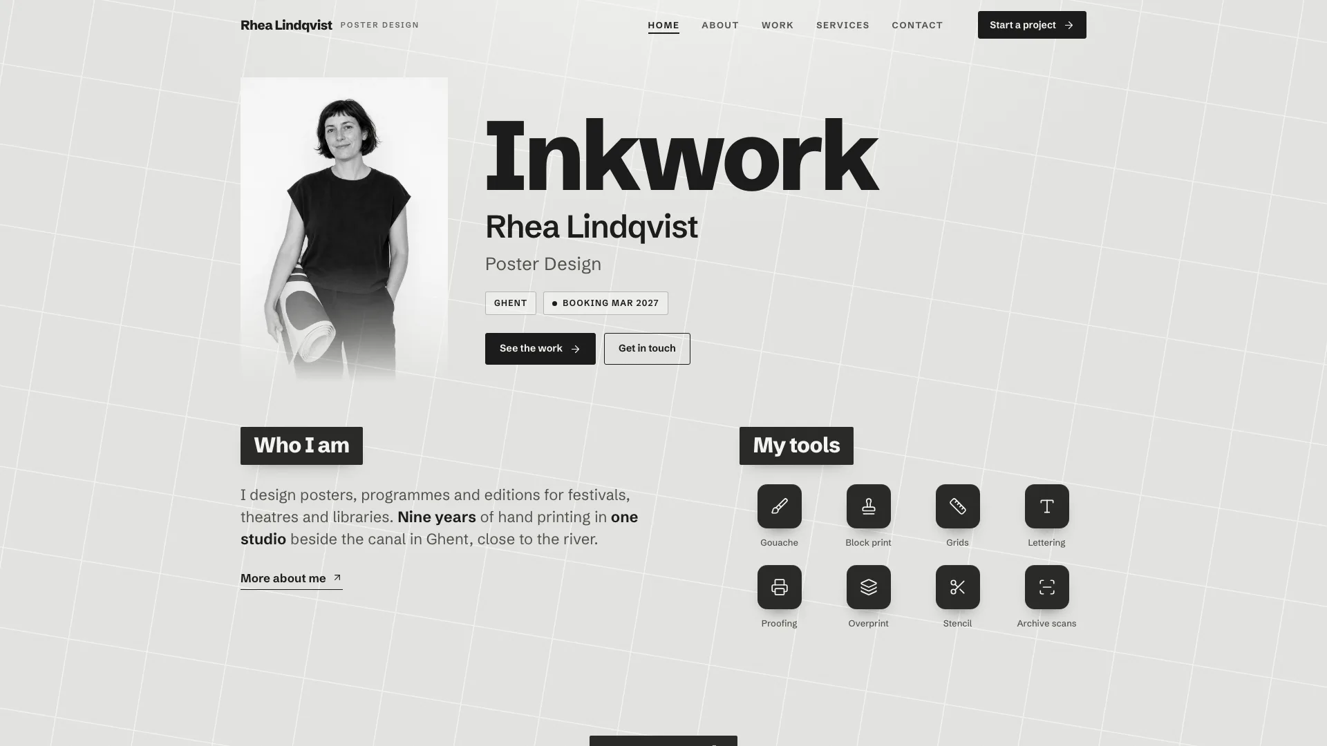
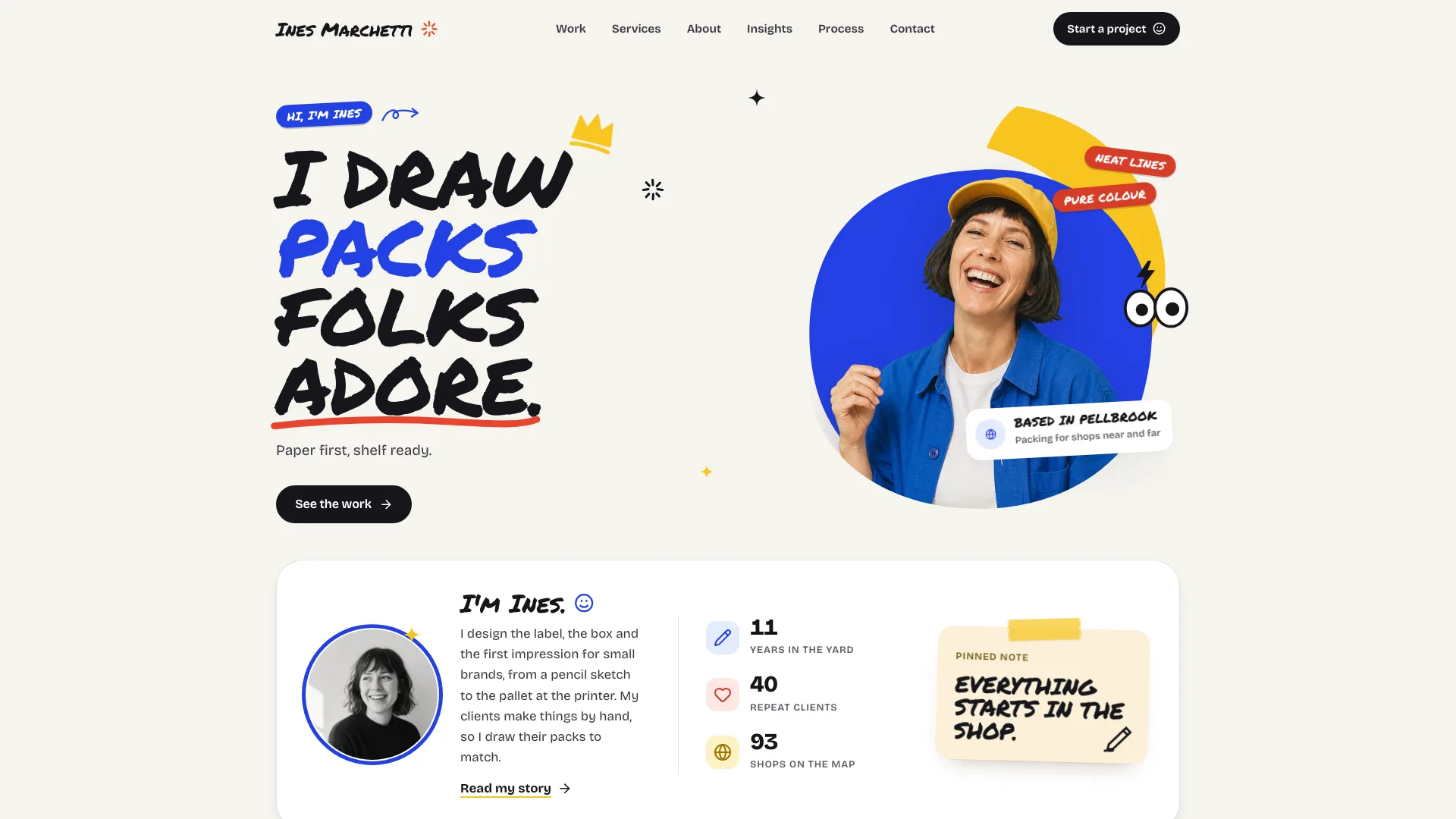
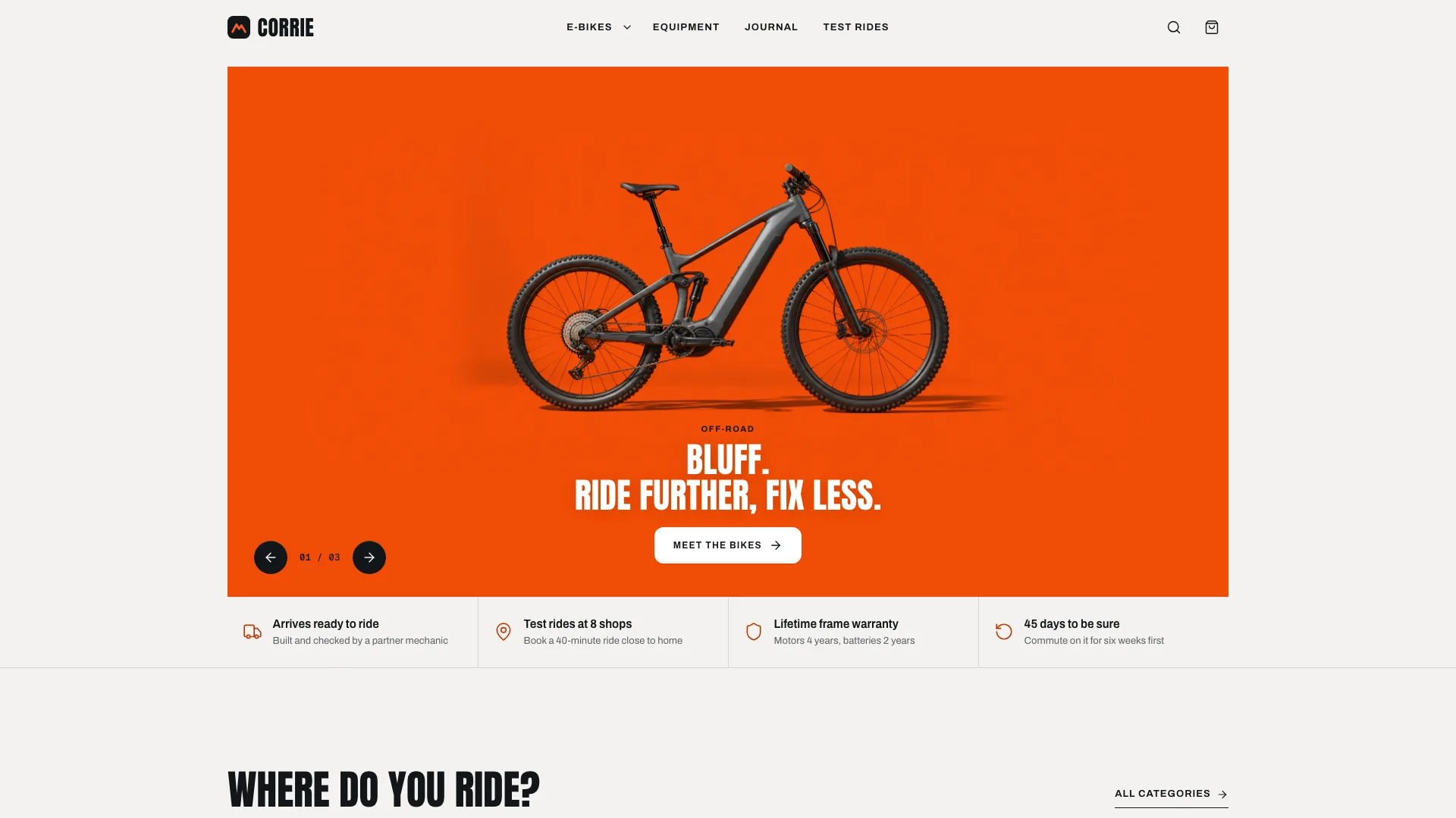
What you get
- A single offline HTML file with 12 hash-routed views that read fine with JavaScript off, light by default and with a dark theme it remembers
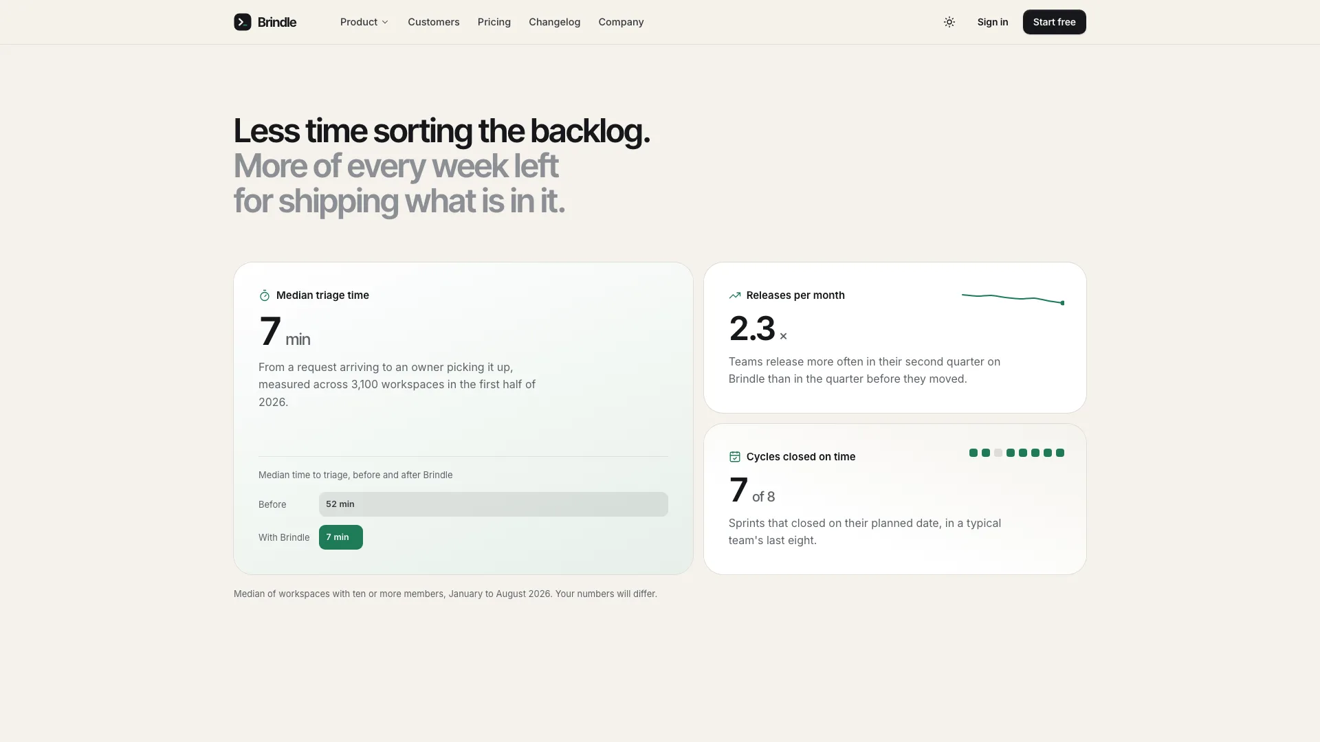
- A home page led by a split hero and a live product window (board, burn-up, roadmap), followed by the wordmark marquee, metrics, a five-tool bento, cycle tabs, a copyable terminal, the evaluation track, security facts, quotes, plans, FAQ and sign-up
- Pricing where one monthly/yearly switch drives three plans, and a grouped comparison that narrows to a single plan on phones
- A searchable changelog, filtered by entry type, with an empty state
- Sign-in (reset and SSO), sign-up that previews the workspace address, and demo booking, each validated inline and ending in a success panel
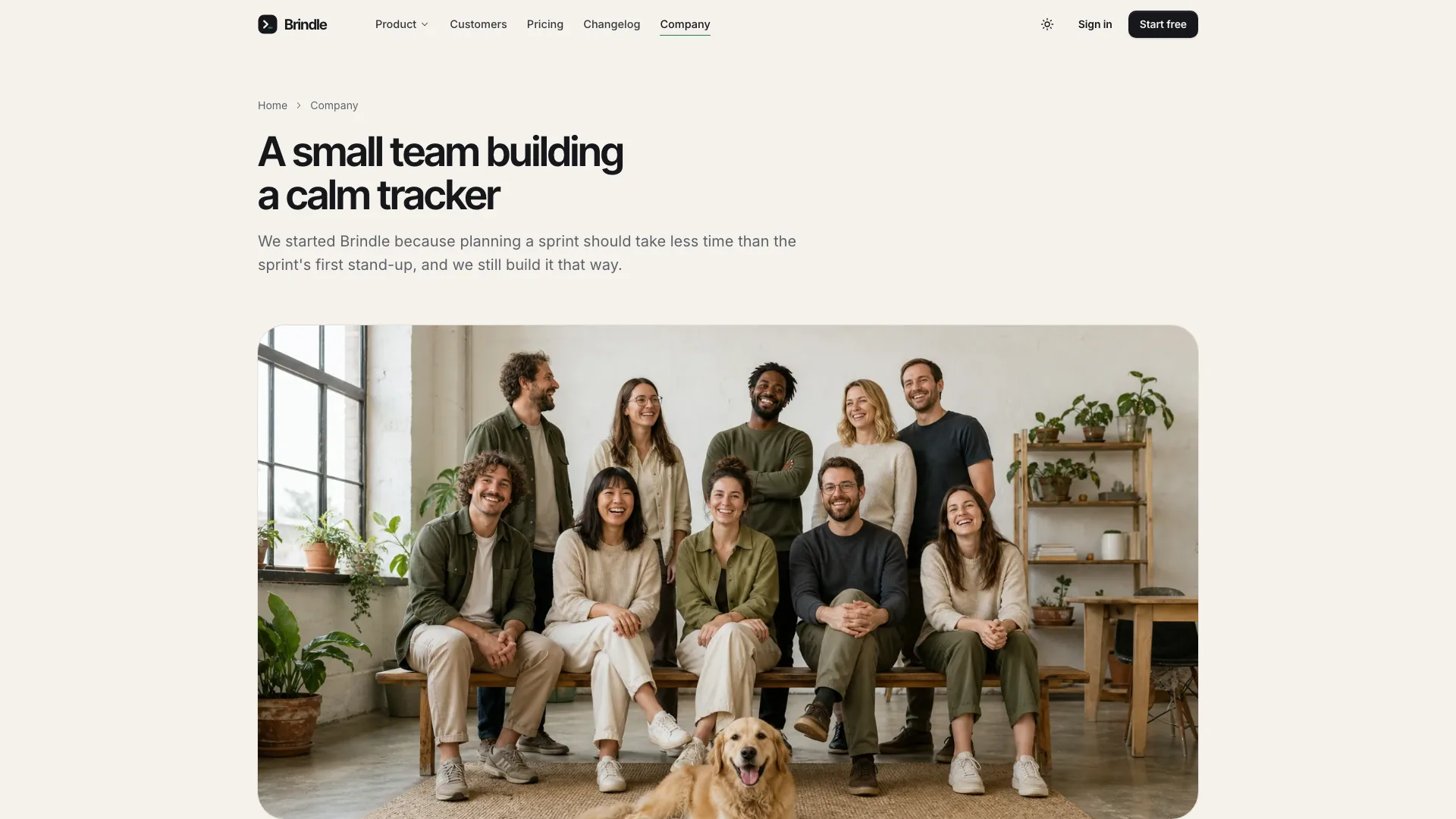
- Pages for security, the customer story, the company and its open roles, privacy, terms and a 404
- Open-source fonts embedded (Inter Tight, Inter, Geist Mono), icons included, and SoftwareApplication structured data
Good fit
- Issue trackers, planning tools and developer products that want visitors to see the product before signing up
- Small teams who need their sign-up, demo and security pages before hiring web designers
- Agencies after a warm, low-key software site with a dark mode that really works
Not for
- Live authentication, account creation or checkout: the forms are previews and send nothing
- Products that don't have real plans, release notes or customers yet
- Brands that want a dark-first look or loud, bright color
About this Skill
Developer tools sell when visitors can watch them work, and that is the brief this Skill gives your Fable 5 agent. You hand over the facts (plans and prices, release notes, this cycle's numbers, customer stories) and get back one offline HTML file. The first screen splits in two: a headline on one side, and on the other a scaled product window that plays once through its board, cycle burn-up and roadmap views while a card slides to the next column. Scrolling on, people try things instead of reading about them: accept or park items in a triage queue, reply in a comment thread, read a team heatmap, flip access switches, filter a command palette, switch cycle tabs for automation rules, capacity moves and a velocity chart, and copy CLI, Git and API snippets from a terminal. Proof follows: customer wordmarks in a marquee, metrics that count up, a track for evaluating the tool, the security facts, quotes in a carousel next to a story card, plans on a monthly or yearly switch, FAQ and a sign-up band. Eleven more views finish the site: pricing with a grouped comparison table, a searchable changelog, sign-in (password reset and SSO included), sign-up that shows the workspace address as you type it, demo booking, a security page with its own request form, the story of one customer, the company page and open roles, privacy, terms and a 404. The styling stays warm and quiet: sand background, near-black ink, tight grotesk headings, white hairline cards on soft layered shadows, a single deep green for accents, mint and darker-sand bands, monospace for ids, keys and code, plus a complete dark theme that is remembered. Forms validate each field inline, and every one of them says clearly that the preview sends nothing.
How it works
- Collect what the product team can publish: plans and prices, this cycle's actual figures, release notes, confirmed security measures and customer stories
- Fill in site.json against the schema so the cycle stats, API sample, thread issue and story figures agree; the build verifies that they match
- Photos: the product-UI avatars and the story photo ship with the Skill, while customer portraits and the team shot are stand-ins for your own
- Run the build, which reports every gap in the brief in one pass, numbers that contradict each other included
- Validate, then try every tool and form in light and dark at widths of 390, 768, 1024 and 1440 px before handing it over
Checked before delivery
- validate.mjs passes: single file, one h1 per view, every link resolves, browser storage only inside try / catch, no colour in hue 235–300 in either theme, one accent, all three fonts embedded, no names from the reference product
- The cycle stats, burn-up, API example, thread issue and pull request, triage time, story numbers, plan prices, savings badge and customer count agree everywhere they appear
- Hero views and card move, triage, thread reply, heatmap, switches, palette, cycle tabs, terminal copy, quote carousel, billing switch, comparison picker, changelog filters, every form and the theme toggle work at 1440, 1024, 768 and 390 px in both themes
What you need before you start
- You bring
- Product name, wordmark, tagline, domain, the hello / security / privacy / careers addresses, legal entity and registered address · A sample workspace for the product window: three teams, nine people, a current cycle with its real numbers, thirteen board issues and a seven-row roadmap · Plans with real monthly and yearly prices, what each includes, a grouped comparison and the billing questions customers ask · Release notes, security measures you can confirm, company story, values and open roles, privacy and terms text · Customer quotes, wordmarks, metrics and one customer story only from real, attributable customers, with photos of the people named
- Dependencies
- Node.js 20 or later · Nothing to install, no keys, no network calls
- Outside costs
- None
- Last tested
- v0.1.1 — Claude Code / Codex / Cursor
User reviews
Loading reviews…
FAQ
Will visitors' sign-ups or demo requests reach me?
Not yet. Each form validates its fields and ends on a success panel stating that the preview sent nothing. Wire the forms to your own endpoints, then change that wording, before the site goes live.
Why does the build care whether numbers match?
One cycle, one issue and one pull request show up in the product window, the terminal, the comment thread and the activity feed. If any copy of them disagrees, the build stops, so the site can't contradict itself.
What does the page store in the browser?
Just two choices: the theme and the billing period. Every storage call is wrapped so it fails quietly, which keeps the file working inside sandboxed previews.
Can the marquee show the logos of companies we work with?
The sample marquee uses made-up wordmarks with simple drawn marks. Add real customers only with their permission, and use photos of the people you actually quote in place of the stand-in portraits.