KPI Trend Panelv1.0.1
Use this Skill to make an infographic.
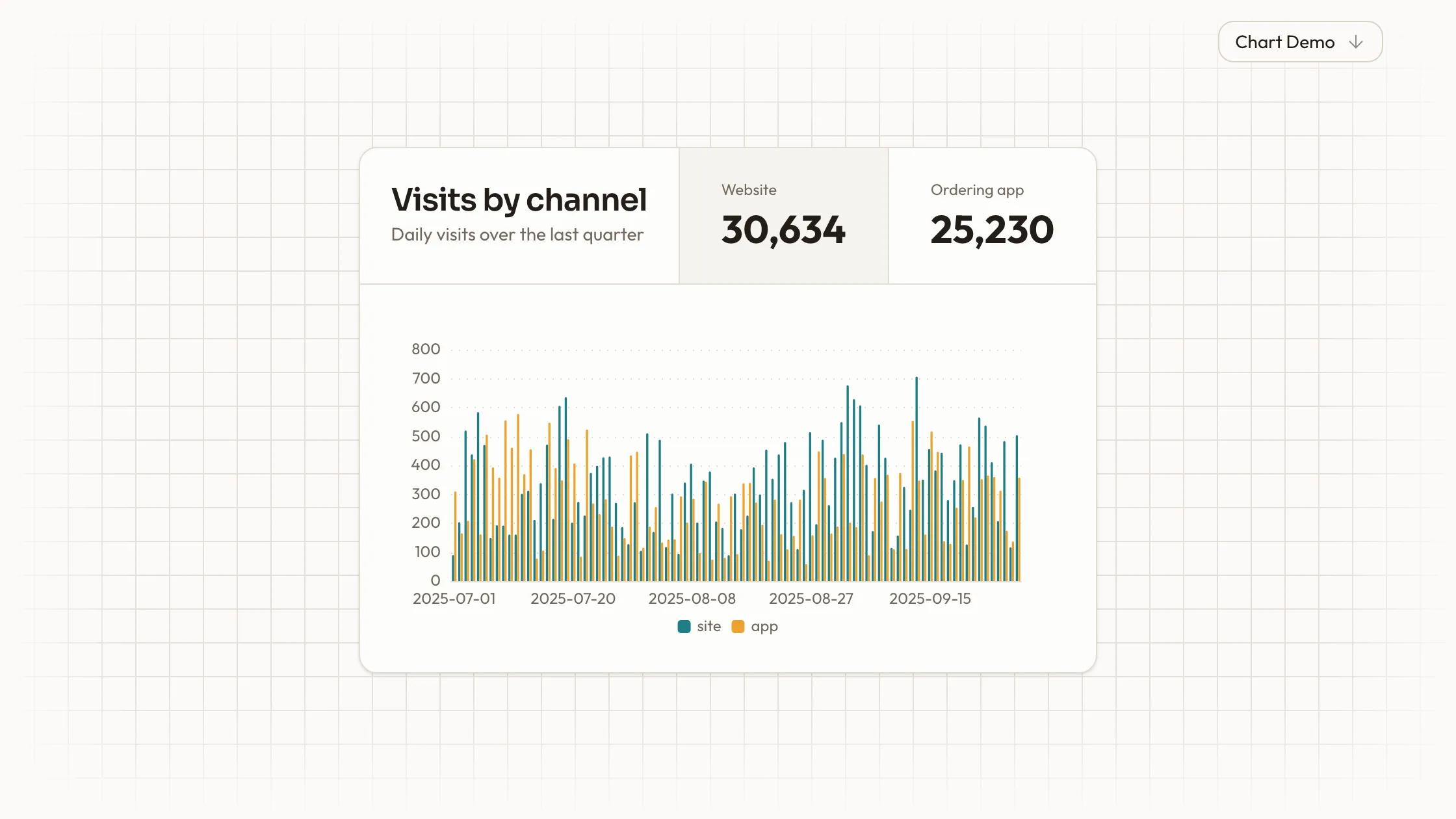
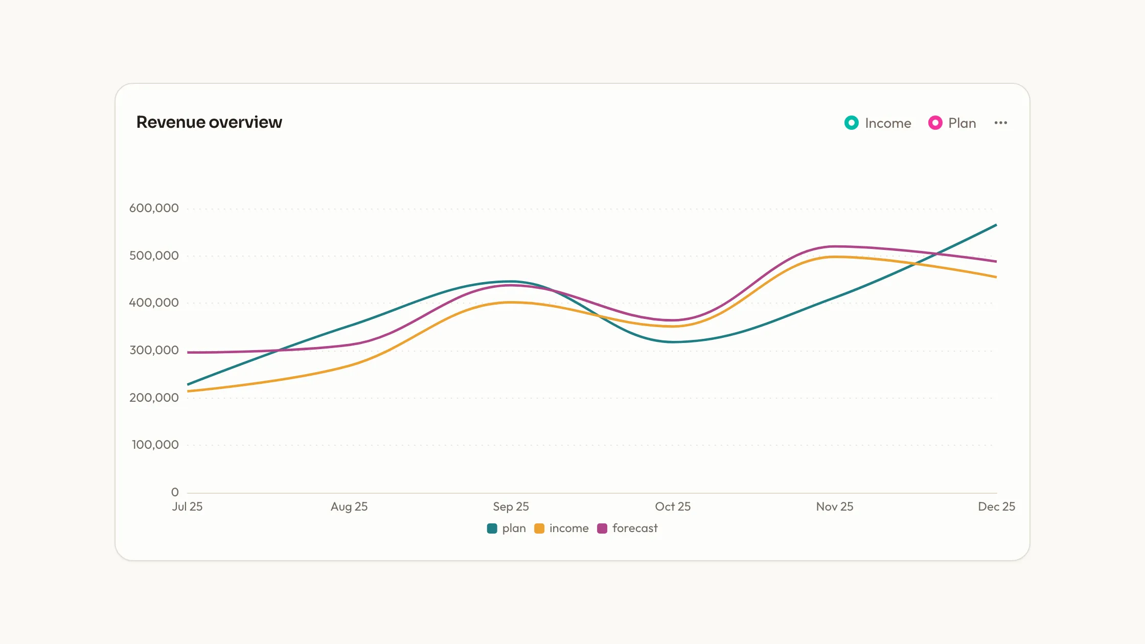
A KPI dashboard skill for Claude Fable 5: four metric tiles with their change pills over one panel of smooth trend lines, as React source drawn by ECharts.
Picked most often by
Updated Nov 6, 2026
Preview gallery


Similar Skills
View all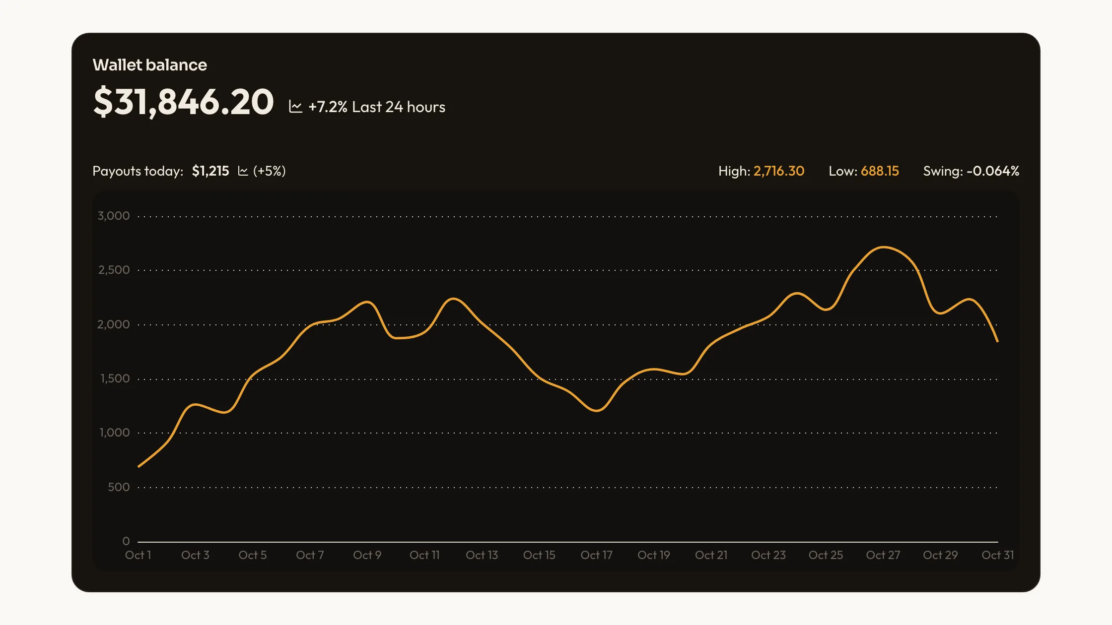
What you get
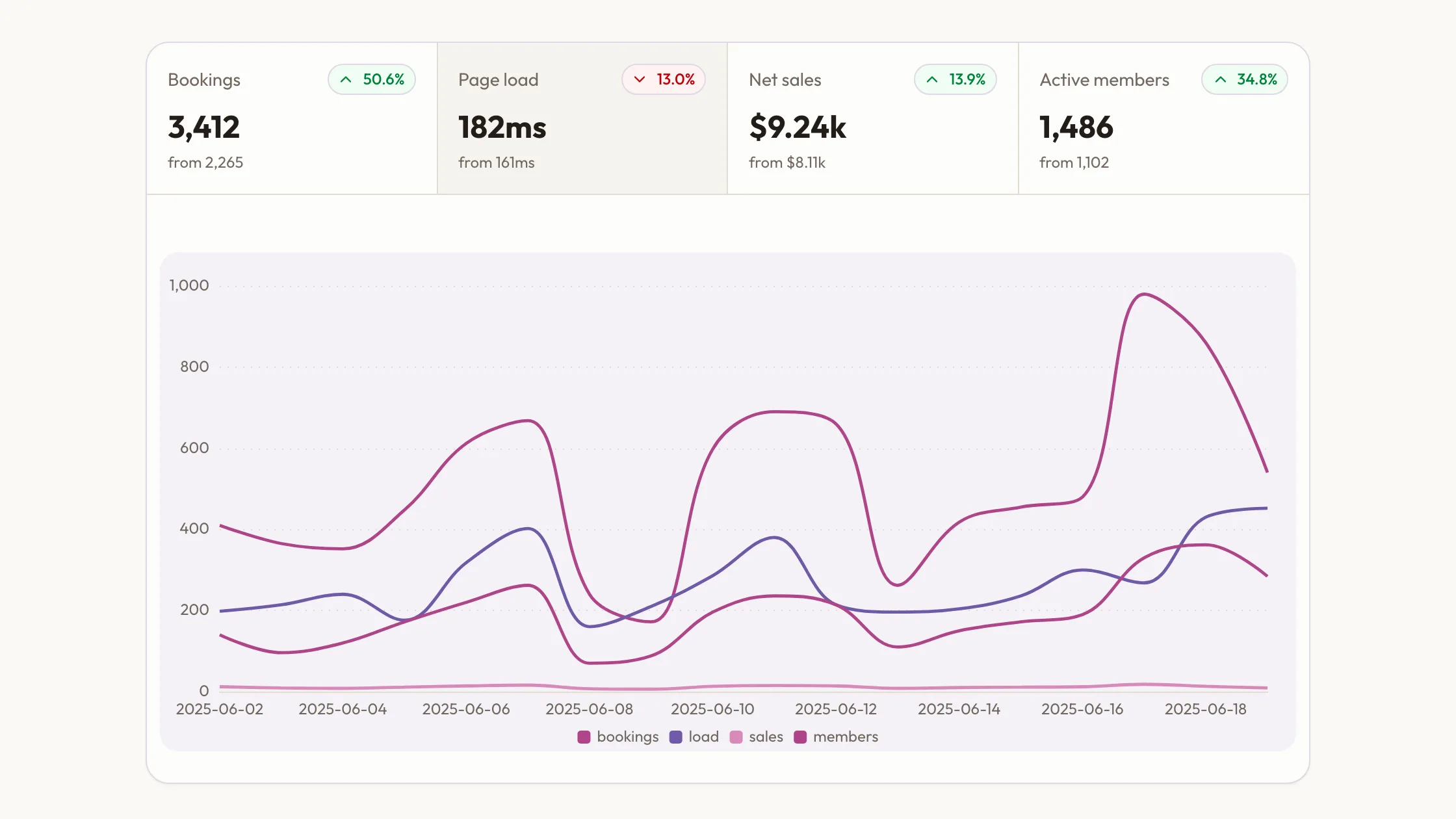
- KPI Trend Panel as editable source: the tile row, the ECharts panel and a usage example with eighteen days of a booking site's numbers.
- Tokens for palette, type, radius, icon stroke and motion from references/theme.md, set once for the block.
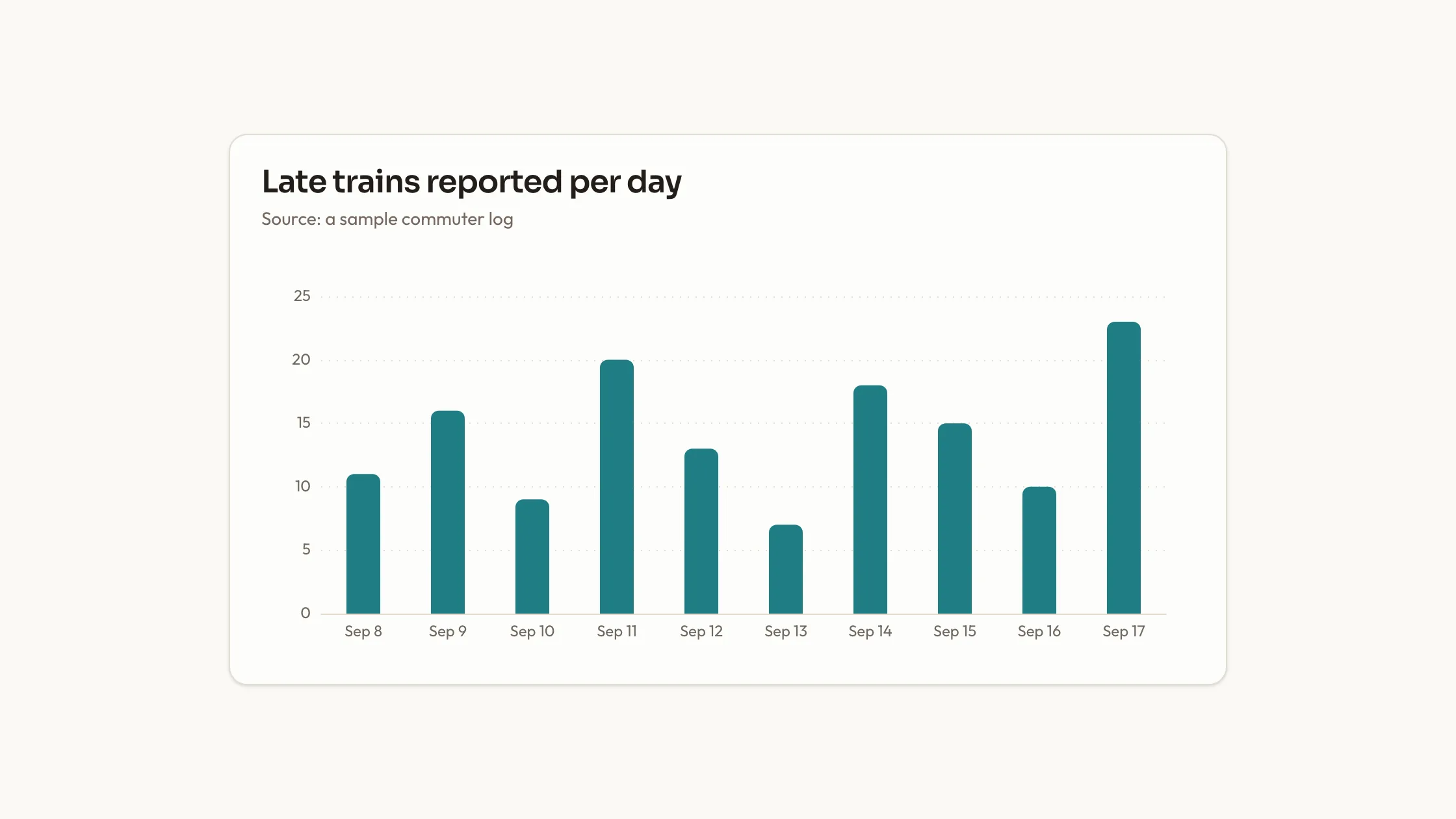
- Every line held in a single ECharts option as plain arrays, so your series go straight in.
Good fit
- Product or business dashboards that open on a handful of headline numbers.
- Metrics where up is sometimes bad, such as load time or churn, and the pill should say so.
- Teams who want the tiles and the trend chart to share one palette with the page.
Not for
- Products that already follow a design system of their own; this block's palette and type scale would compete with it.
- Anyone wanting a versioned package from npm; you receive source code and keep it up to date yourself.
- More than four headline metrics in one row, or values streamed in real time.
About this Skill
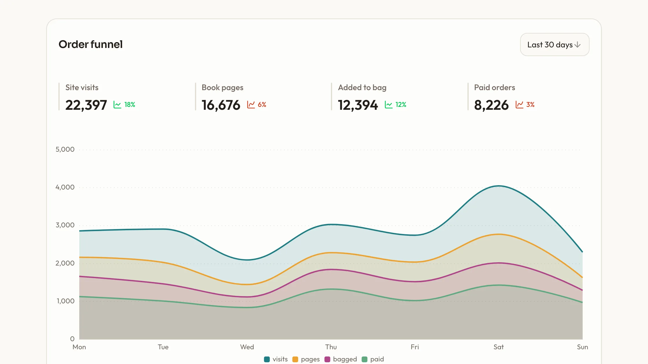
KPI Trend Panel is a KPI dashboard skill for Claude Fable 5 that puts two to four headline metrics, and the series behind them, in one card. Each tile across the top shows where its metric stands now, where it began and a pill with the change, worked out from those two numbers. You say per metric whether a rise is good or bad news, so a slower page load turns its pill red. Click a tile to highlight it. The panel below plots every series as a smooth ECharts line, with a legend and a tooltip naming each value at the date under the pointer.
How it works
- Say which page gets the block; the agent studies package.json and the framework config, then writes it in the project's own idiom.
- Swap in your own titles and labels; the theme tokens keep sizes and spacing in place.
- Hand over your real series; ECharts redraws them in the same colors and axes.
- Run scripts/check-blocks.mjs, then view the page at phone width before it goes live.
Checked before delivery
- Each tile's change is worked out from its two values, and its pill turns red when the move is bad news
- Every series is drawn as one smooth line through ECharts, with the axis tooltip naming each value at the date under the cursor
- scripts/check-blocks.mjs reports no symbol icons, no off-palette blue or violet and no remote files
What you need before you start
- You bring
- Two to four headline metrics, each with its current value, its value at the start of the period and whether a rise is good or bad news · The series behind them: one label per date and one number per date for each metric
- Dependencies
- ECharts 5 or newer, installed with your project's package manager
- Outside costs
- None
- Last tested
- v1.0.1 — Claude Code / Cursor
User reviews
Loading reviews…
FAQ
How is each tile's change worked out?
From the current value and the starting value you give, and the pill turns red whenever the move is bad news for that metric. The block is React; in another framework the agent rebuilds it and keeps ECharts for the lines.
Does the block fetch anything online?
No. Fonts, icons and pictures stay as local files, and scripts/check-blocks.mjs flags any src, href or url() pointing at another host.
How do my own numbers get in?
ECharts reads one option object whose labels and values are plain arrays. Replace them and the colors, tooltip and animation stay put.